Improving a bad visualization
Recently, I started following Dr. Kelly Bodwin and Dr. Hunter Glanz‘s public-facing version of their Stat 431 course at Cal Poly. Weekly, they update and post the materials on the the course’s website.
The topic for week two was “Advanced Data Visualization”, and the first part of the lab was a task to recreate this plot from Wellcome Global Monitor from 2018:
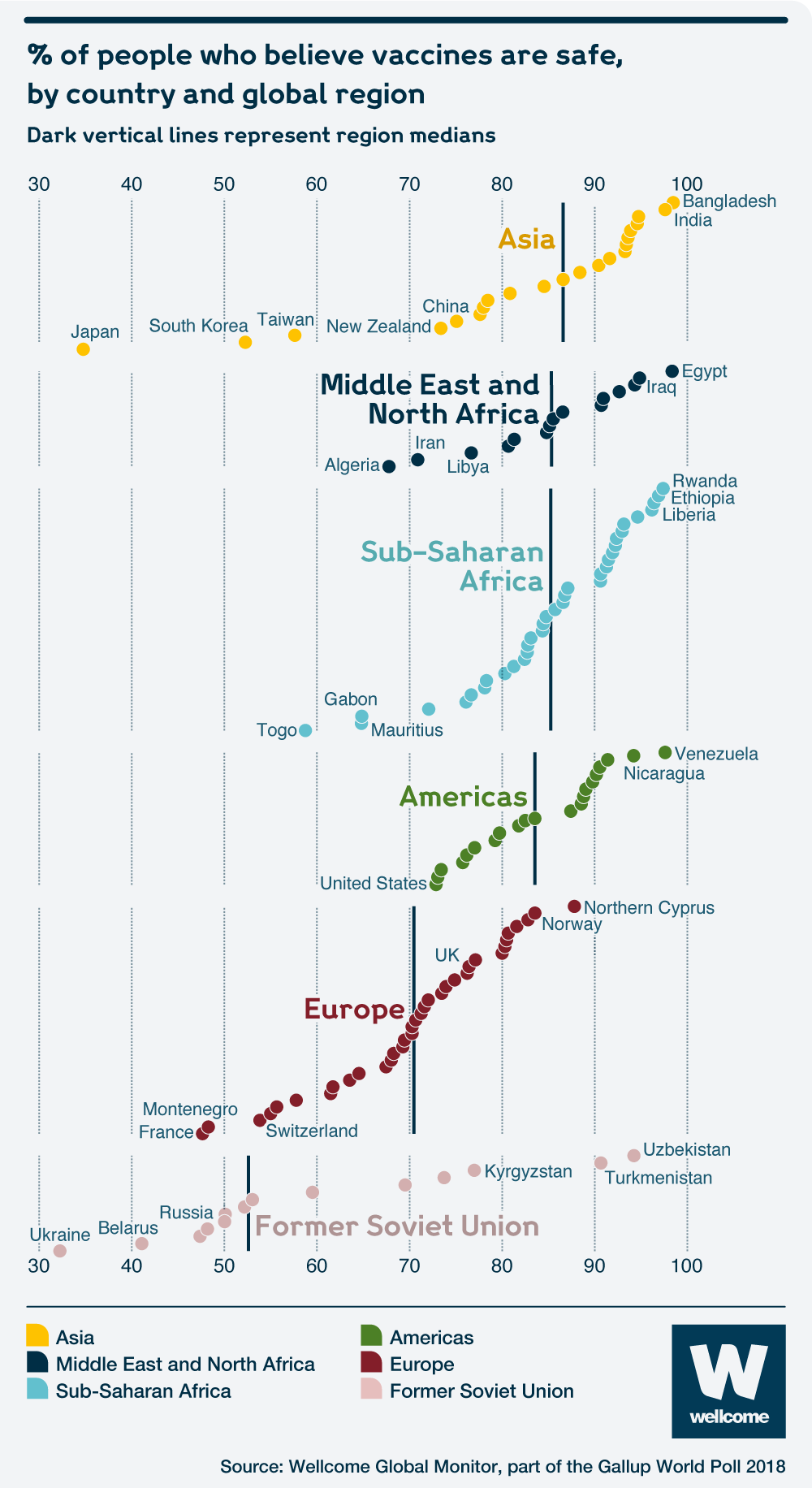
This plot is quite problematic. There is no clear y variable– We don’t know on what basis the points rise and there could be information loss because of this or an unclear picture of that the author was trying to convey.
In an attempt to address these issues, I decided to focus on the distribution of the views of each region, rather than specific countries. The ticks on the rug each represent a country, so we can see where they are in the distribution. Like the original, the median percentage of people who think vaccines are safe per region is also shown. Unlike the original, I included the full range of the percentages on the axis to put the values into perspective.
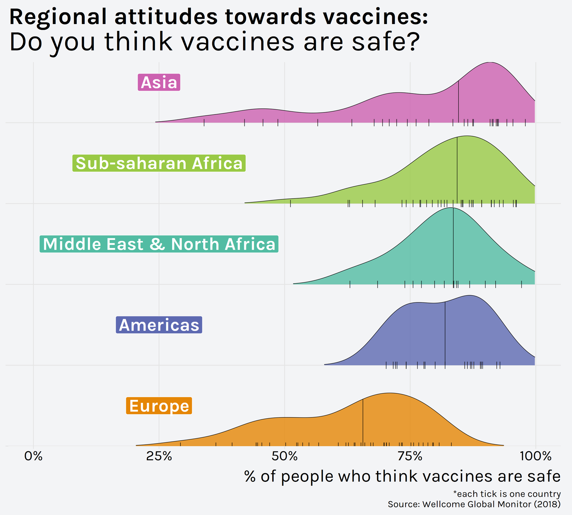
The data could also have been visualized using a beeswarm plot, which would allow for highlighting of specific countries as in the original plot.