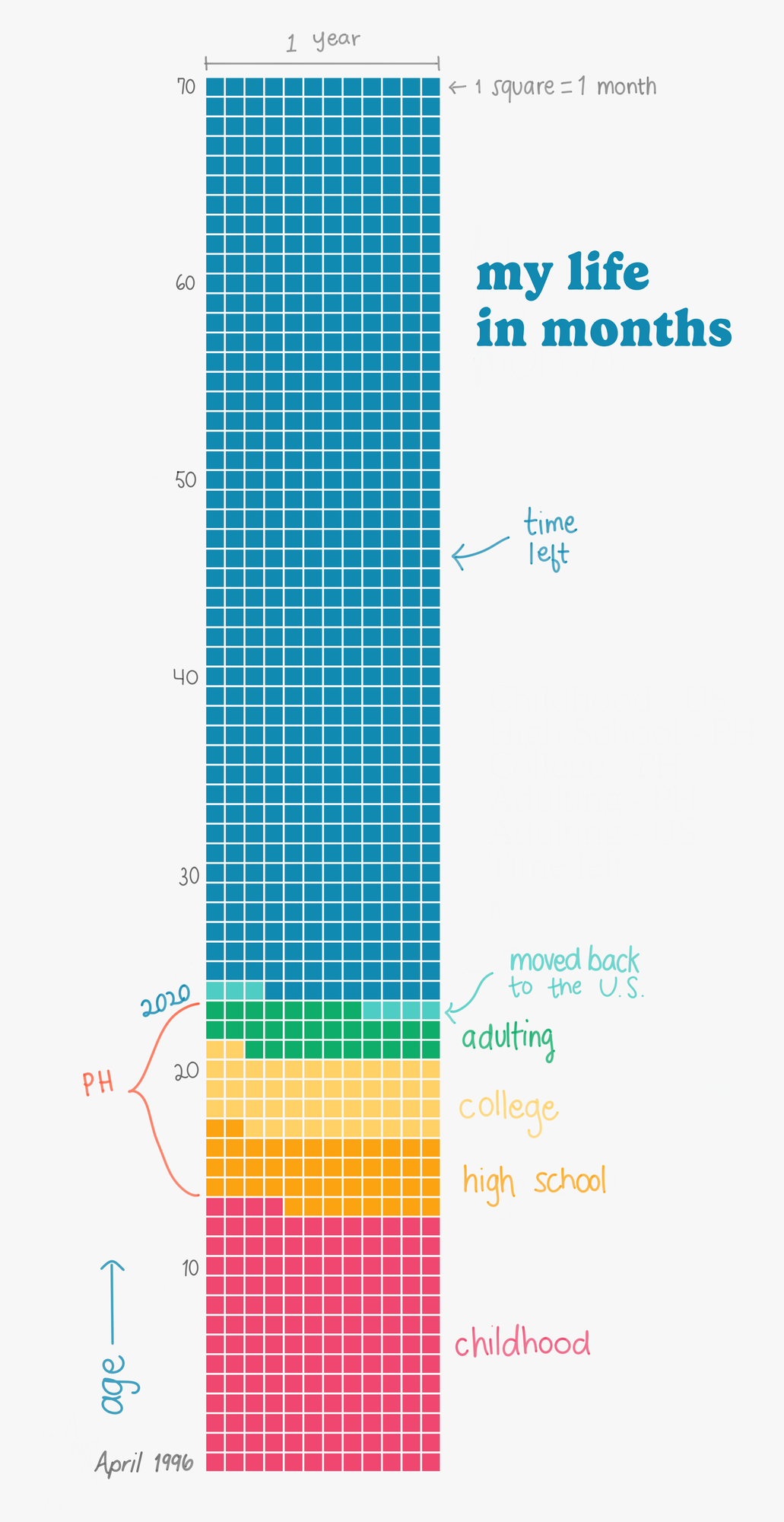
The other day, a friend shared this way he discovered to keep himself motivated– by looking at the big picture, literally, by visualizing his approximate life span by month. I thought it was a great way to put everything into perspective, especially right now with life feeling even more uncertain what with everything going on in the world. It was also the perfect opportunity to try making a
waffle chart for the first time and to use my new Bamboo Ink stylus.
I decided to make 70 the last age in the chart since I assume that would be the age until which I would be the most active in my life. I made the chart itself in R by creating the data and using ggplot2 & waffle. To fill in the whitespace in the output png and add the title text and handwritten annotations, I used
Sketchbook and my Bamboo Ink stylus.