isabella benabaye
Hi! Welcome to my personal site. I blog about the things I learn, mostly in R and python, and you can find my latest work below. More about me
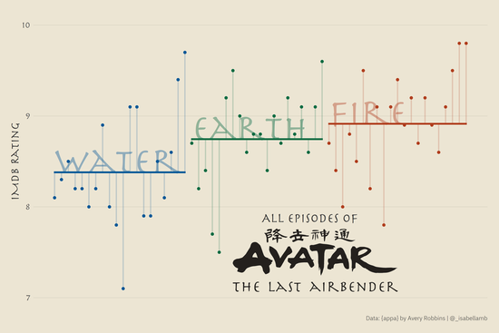
A recreation of Jack Davison‘s Tidy Tuesday plot.
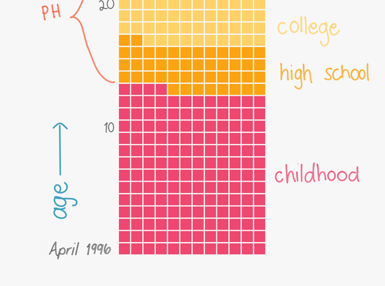
My life in months: A waffle chart of each month in my life until age 70, made using R and Sketchbook.
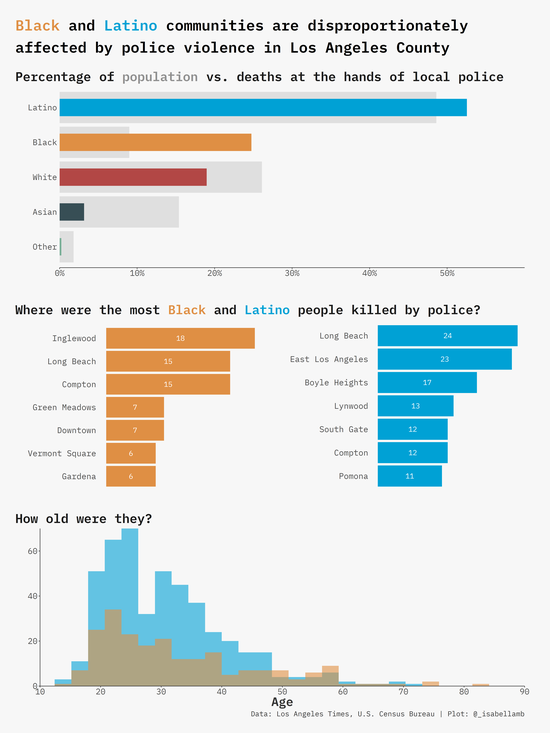
The Los Angeles Times recently released their database of people who died at the hands of police in L.A. County since 2000. After reading their article about it, I wanted to learn a little more about the two communities affected the most, particularly the Black community.
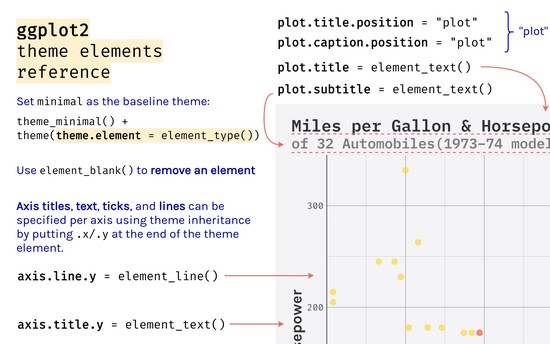
Inspired by Henry Wang❜s ❝ggplot2 Theme Elements Demonstration❞, I created one for myself displaying all of the elements I frequently use and always google.
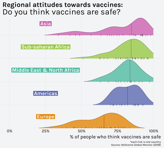
Recreation of a visualization originally published by Wellcome Global Monitor in 2018.
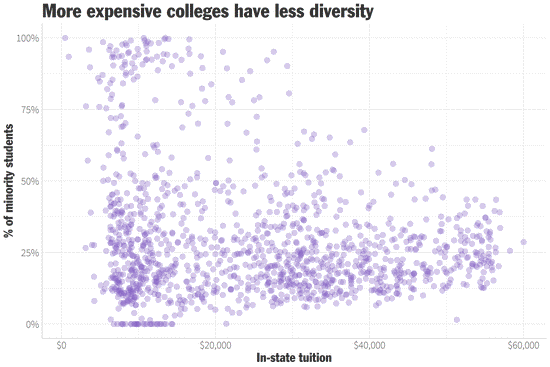
Diversity/minorities = all students who are not categorized as white, race unknown, or a nonresident. Student diversity data from The Chronicle of Higher Education (2016).